Monday, November 29, 2010

Drawing in Lo Res


For lack of a scanner, I've taken to simply photographing my drawings with a digital camera and touching it up in photoshop to correct for the deficiencies of that process. Thus, the relatively low resolution image above (not quite my customary 1600 by Whatever).

Wednesday, October 6, 2010

Just Some Fun with Illustrator


Perhaps the tiniest image I've uploaded, but I'm mostly using this post to host the image for use elsewhere. Shhhh!

Tuesday, September 28, 2010

A Little Banner


A quick banner I made for one of my campaign websites over on the awesome Obsidian Portal. Sketched the figure and shadowy skyline in a few minutes on my tablet and just messed with the colors for a few more minutes. Total of 15-20 minutes work, but I like it.

Thursday, August 5, 2010

A Fast Sketch

I drew this picture over the course of about half an hour spread out across my day as I could snatch moments while my computer was otherwise engaged.


This picture could be considered a bribe. I drew it to keep one of the players thinking about a Shadowrun game I'm running - he generated a character for it with everyone else but hasn't been around since the first session. Hopefully, this will help keep his mind on it.

Tuesday, August 3, 2010

A little commercial-looking work


This is a little something I put together for my wife's blog. She's been asking for a logo for a little while, and she wanted 3 infinity symbols arranged in a triangle. Well, I made 8 designs and went through them with her until she settled on one, then added the text... and here we are. Turns out I can design logos and stuff. Who knew?

Monday, August 2, 2010

DVD Labels...

... for my demo reel and for a video I produced for MNF-I during my deployment. The video was cleared for release, but it never went to congress as intended due to the transition of command from Gen. Casey to Gen. Petraeus.


Hopefully, more presentable copies will inspire more interest, and I'll reap more benefit from my time away from home and family.

Tuesday, July 27, 2010

A Dramatic Entrance

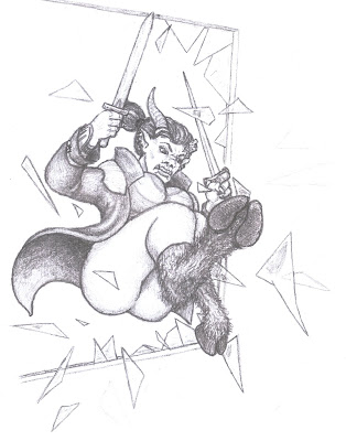
Ioda makes a surprise entrance through the window.


Well, I return to the whole art-blog thing just in time to meet my monthly Sharply Dressed Heroines obligation. In case you were wondering, she's a Satyr crashing through a window.

"Why would you draw that?" you ask. Good question. The inspiration for this particular image comes from some good old-fashioned table-top roleplaying action. Shadowrun was the game, and one of the Player Characters was a Satyr (a variant of Ork in that game) looking for a surprise entrance to the a gun-runner's hideout.

Tuesday, June 29, 2010

Promises Kept

So, last month I posted my first Sharply Dressed Heroine. I promised to make it a monthly feature. So, here, before the end of June, I keep that promise. I hope you enjoy it.


This is a quick scan. The original drawing was done in pencil, then gone over in pen and marker for a nice, crisp look. Perhaps I'll take it into Illustrator later or make a background in Photoshop. I may even colorize it if the fancy strikes me (or if anyone is interested).

I've got a couple of more fully-rendered pencil drawings I'm trying to finish up this week that'll hopefully make for a couple of nice posts later this week or weekend, too. One of them I started a long time ago, and the other more recently, but I've been itching to finish them.

Tuesday, June 15, 2010

Surprise! You're a Lackey


The above is a design for a t-shirt. A moderately expensive design, considering it uses 3 colors, and limits the underlying shirt color to a medium tone. Still, I've chosen to imagine what it will look like on a shirt (no drop shadow, to start).


Want one?

Monday, June 14, 2010

Far too complex...

...for a real logo.


I was in the midst of designing a t-shirt based on a conversation that followed a lively session of a superhero-based table-top roleplaying game, and I discovered I needed a logo for the organization the t-shirt would mention. This isn't something I'd use for a real organization - real logos should be a little simpler and more easily understood, but this does the trick for the shirt.

10 Points to anyone who understands the slogan on the image.

Monday, June 7, 2010

Feeling Like Sergeant Opet...

...or How 5 Minutes with a Marker can Improve Everyone's Morale

We had a bit of a long Battle Assembly (Reserve Drill) weekend this month. A pair of early mornings, coupled with some long drives left a lot of people with some frustration and frayed nerves. To top it off, the drive to the range on Saturday started with SSG Wright being scared half to death.

She's terrified of wasps and bees. The Humvee we were about to drive down just happened to have a nest of those particular insects directly above her seat. Luckily, some good observational skills and quick reaction from a few of the other passengers solved the problem without anyone getting hurt, but it still caused some momentary panic and confusion.


That evening, when we finally had a few free moments, I pulled out a pencil, a marker, and my sketch pad. 5 minutes later I had the little cartoon you see above - just in black and white (I used Photoshop to add the colors). After getting SSG Wright's approval (I wouldn't want to offend her), I showed it around the unit, to good reception. I may just do more of these for drill weekends where events occur that warrant it.

Friday, June 4, 2010

Processing!

This week, I took an old drawing I did several years ago (2005, to be precise), and used Photoshop on it. You judge the results.


Here is the final result, and below follows the original scan (reduced to jpeg and a reasonable size for web uploading, of course).


I like the original drawing, but the color gives it some of the life it was missing. I'm not entirely thrilled about the colors on the rocks (especially as you drift toward the signature), but I think that overall it is satisfactory.

Also, I shall now point out that Shadowrun is a fantastic game. Not the video game, though. We shall not speak of that.

Sunday, May 23, 2010

Oh, Free Scanner

Sometimes my capacity for ingratitude makes me lose faith in myself. A friend of mine gave me a flatbed scanner. Free. No charge, not even a favor. Hardly an expensive one, but she had another, better scanner, and no need of this one, so she gave it to me.

I had some trouble installing it, thanks to Windows' inability to find the correct driver, and the correct driver's inability to operate the hardware without some tweaking (note to self, when actually purchasing a scanner for myself, do not buy Lexmark). That trouble frustrated me. Then, when scanning a couple of pencil drawings rife with delicate shading, I found that the scanner simply couldn't pick up the finer marks, regardless of how I changed the settings. Rather than immediately accepting this as the limitations of a free scanner, I actually had the gall to get mad. I'm over it now, though, and I must say I feel a little silly about it.

On to the image:


And now, the story behind it:

My wife and I attend the Pittsburgh Comicon every year (military duty permitting). This year, while wandering artists' alley, she laughed about the outfits worn by 95% of female action stars in comic books, and asked me if I could draw a monthly series she first called "women with clothes on" to differentiate it from the comic book norm. Now, almost exactly one month later, I've finally gotten around to drawing the first one of these Sharply Dressed Heroines. I'll try to post one picture a month of an action girl or heroine wearing reasonable or practical clothes for their professed activity or expertise. No guarantees.

Also, let me pause to link Scott McDaniel's web site. He's one of the best artists in the comic book business, and a fantastic person to know. His home page could use some work (frames are so 2001, amirite?), but his art is 1st rate and he's taught me a lot in the time I've known him. Do him a favor and pick up a copy of DC's Great Ten mini-series.

Friday, May 14, 2010

On Photography

Let's face it. I'm a dying breed. I shoot on film. I like all the imperfections that come with it, and I even like having to wait to see my images.


While we're on the subject of waiting, here's a picture I took in the summer of 2008, while enjoying the sun and waves on Cocoa Beach for the Army.

Don't get me wrong. I've got no problem with digital, and I even shoot with digital most of the time - because it is easier (though getting a good picture is just as hard and the creativity is the same, you get to see if you messed up and you can try again immediately if you did).


This picture illustrates just what it is I love about film. Maybe this small size won't do it justice, and JPEG compression certainly does a number on the vividness of the colors, but the rays of the sun and the little film spot balancing them down at the bottom make this image what it is for me, and that film spot is exactly that - it would not exist like that in a digital camera.


This last picture would likely have been just fine with a digital SLR, or any camera in which I could precisely control the exposure as I did. I do think the colors are a bit more vivid than most digital cameras produce, but again, some of it was lost in the JPEG conversion (I've got the 23.7 MB tiff files if you want them...). Finally, though, digital cameras just don't quite do film grain, which is a feature of film images I've come to love - the "grain" that occasionally crops up in high-ISO digital photography is too perfectly regular, occurring as it does from a perfect grid of pixels. The alignment of particles on film is almost truly random, so the grain is never quite the same picture to picture, and I love that individuality of image.

Long story short, I like digital photography... but I love film.

Tuesday, May 11, 2010

Bivouac of the Dead


Well, my wife and I just returned from a weekend in Gettysburg, PA, and I wanted to update my computer's desktop with one of the fantastic photos she took (mine are still in film form waiting to be developed because I'm stuck in the last century). I had to resize the photo to fit my desktop, but then, of course, I got carried away. Here is the result. Click to embiggen and make the text readable.

Sunday, April 25, 2010

Off the drugs now


A much-needed sign for my dining room. The floor is just sufficiently giving that repetitive movements set up a vibration that may harm all the glassware in my wife's china cabinets.

Wednesday, March 24, 2010

A Layout, to be finished later


Turns out my base sketch over which I do my detailed drawings is truly too light for my silly little feed scanner to properly detect. The above image is quite preposterously photoshopped just to make most of the lines semi-visible. Well, hopefully that particular problem will be solved before too long.

Still, this is obviously just a page layout, roughing in the shape of the cells and the positions of the characters, objects, and text. The plan is to spend further days this week actually turning this into a proper, visible, colored page complete with text and some sort of header bar that advertises the character. We'll see how much of that I get done. At the very least, I'll have some sort of semi-complete product posted on Saturday, to meet my weekly requirement. Hopefully sooner, but I can never be too sure how much time it will take or how much time I'll have to devote to it. At any rate, I may just post the page's header bar (which will be designed separately anyway) as another bit later on this week. Perhaps tomorrow or Friday.

Monday, March 22, 2010

Some Kind of Octopus

Tearing my shell apart, letting the sea get in - you make my insides outside.


Well, I guess a photo will do for this as well. I'll update this image and many others as soon as I have a scanner - even some of the purely digital ones have been updated because I can't help but continue to perfect them when given the chance. I like the octopus, here, though. Satisfies my cephalopod obsession of the moment.

For want of a scanner...

Well, I completed another pencil drawing for this here blog last night, but for want of a scanner I was unable to post it at that time. I should be able to snap a photo of it to post by the end of the day. My feed scanner simply won't do it any kind of justice, as it is terrible at recognizing grayscale images. Long story short, I'll have the drawing up by the end of the day today, and hopefully a second drawing to go with it.

Saturday, March 20, 2010

On Transportation

I've always thought motorcycles are cool. Here's the proof.


The original is actually drawn about 3 inches by 3 inches. I used Illustrator to blow it up and to add the background. Nice and quick and easy.

Thursday, March 18, 2010

A Day Late, and Something about Money...


A little something I made for St. Patrick's Day. Unfortunately, I started doodling it at work, and didn't give myself the time to finish it when I got home, because I went to a friend's house to hang out for the holiday instead. But, I finished it today!

Sunday, March 14, 2010

The Final Product, late for want of a scanner


The title says it all. Someone has generously offered me their old flatbed scanner, but until then, I'm using a woefully inadequate feed scanner to bring this stuff into photoshop. Alas, I am not yet the master of such things.


Saturday, March 13, 2010

Part One of a Larger Project


This is the logo and background for the next work I intend to upload here (hopefully by the end of the day, in order to fulfill my weekly obligation).

Wednesday, March 10, 2010

Better Late than Never

So, I've truly done a terrible job of starting this thing off correctly. To remedy that, here I present the first work of art created expressly for this blog - the Beer Bear.


While searching for inspiration, I asked my wife what I should draw, and her suggestion lead to this. I'm certain this isn't exactly what she was thinking, but it works for me.

Thursday, March 4, 2010

The 1st Week Begins March 7th, 2010

I've no artwork to post yet today, or likely this week, but I feel that having a proper post here is important, even if all I do is define my purpose for beginning this endeavor and establish the writing tone.

Purpose
For the last several months, or perhaps as long as this last year, I've felt somewhat stagnant and unproductive. I've come to realize, or perhaps merely believe, that one of the great causes of this is that I've been letting my artistic talents languish. I've produced remarkably little since graduating with my Associates Degree in Art, and I wish to remedy that.

To that end, I shall post here on this blog 3 brand new works every week (with certain exceptions as follows: weeks with more than 2 days of military duty, weeks wherein I am ill for more than 3 days, or weeks containing one of the following holidays: Christmas, New Years, or Easter). Seems like a lot of exceptions, right? Well person-I-just-asked-a-rhetorical-question-of, as this is being presented in a public place, and contains my own art and products, potential employers would rightly look here and must know that I am reliable. It is almost inevitable that I should be prevented at some time from posting the self-required 3 works per week, and I shall always endeavor to provide ample cause, with a full post detailing the circumstances if it falls outside the above examples.

Additionally, this will be a learning experience for me, as I experiment with new techniques and styles and post the results of my efforts here. It will give me the power to review my work many months or years hence and see just how far I have (or haven't) advanced, and it will afford that benefit to all other readers as well.